- TimWalkerPhotography - (Tim Walker Research): http://www.timwalkerphotography.com/biography
- Wikipedia - (Tim Walker Research): https://en.wikipedia.org/wiki/Tim_Walker
- Wikipedia - (Retouching): https://en.wikipedia.org/wiki/Post-production
- Daily Mail - (Retouching): http://www.dailymail.co.uk/femail/article-3210429/Feminists-ages-strip-underwear-Photoshop-finger-celebrate-fact-real-women-come-shapes-sizes.html
- Wild Beauty World - (Retouching): http://wildbeautyworld.com/2012/07/11/is-photoshop-an-enemy-of-feminism/
- Metro - (Nathalie Croquet spoof): http://metro.co.uk/2015/08/17/brilliant-photo-series-shows-what-beauty-and-fashion-campaigns-look-like-with-a-non-model-5347302/
- I-D - (Nathalie Croquet spoof): https://i-d.vice.com/en_gb/article/nathalie-croquet-questions-beauty-ideals-in-perfectly-replicated-fashion-ads
- Bored Panda - (Nathalie Croquet spoof): http://www.boredpanda.com/fashion-parody-ads-nathalie-croquet/
- 7 Photographs That Changed Fashion (2009)
- Wikipedia - (7 Photographs): https://en.wikipedia.org/wiki/Cecil_Beaton
- Biography - (7 Photographs): http://www.biography.com/people/cecil-beaton-38501
- Wikipedia - (7 Photographs): https://en.wikipedia.org/wiki/Erwin_Blumenfeld
- Fashion Telegraph - (7 Photographs): http://fashion.telegraph.co.uk/columns/tamsin-blanchard/TMG10062375/The-extraordinary-story-of-Erwin-Blumenfeld.html
- Wikipedia - (7 Photographs): https://en.wikipedia.org/wiki/Richard_Avedon
- Wikipedia - (7 Photographs): https://en.wikipedia.org/wiki/David_Bailey
- Wikipedia - (7 Photographs): https://en.wikipedia.org/wiki/Helmut_Newton
- Wikipedia - (7 Photographs): https://en.wikipedia.org/wiki/Guy_Bourdin
- Wikipedia - (7 Photographs): https://en.wikipedia.org/wiki/Herb_Ritts

Thursday, 3 December 2015
Bibliography
Evaluation
I have really enjoy our digital image sessions and I felt I have learnt a gained a great deal of knowledge on photography, lighting, general camera settings, and equipment compared to when I first started this year I wasn’t as confident with a camera at all and now I feel I could produce decent images and be proud of them. However the only think I’d change is the make-up I did for the shoot, I wish I had more drama on the eyelashes and more definition with the eyeshadow as with the lighting the eyeshadow didn’t show up as much as I’d of liked.
When it came down to finding inspiration and researching photographers I watched ‘7 Photographs That Changed Fashion’ and took it upon myself to research the featured photographers mentioned. This really helped me figure out what kind of photography style I like, as each photographer had a different style and mood about their work which then lead me to research other photographers work such as my favourite photographer Tim Walker and Nathalie Croquets 'SPOOF' Series.
After learning about different photographers we was then taught about post production and how this has effect on todays society, fashion and make-up industry. With post production I found quite easy as I had previously learnt some tricks in earlier education so I knew the basic editing, but it was also helpful to learn some more techniques that can help make your image look better but not in an over edited way.
Shooting my final images was quite nerve racking at first as I wanted them to turn out as good as I could get them, but once I had got the equipment set up and working I was quite relaxed when directing my model and telling them how to pose and move their face and body. When shooting as well I didn’t just stop after a few images, I made sure I had a few back ups incase when it came to post production they didn’t meet my expectations in what I wanted for my final images and I also made sure I had variety in my poses and composition. Overall I’m very pleased with how my final images turned out and thought both my models did such a good job in giving me what I wanted for this project.
Final Images: Black And White Beauty


These are my final three black and white images that I took in the same studio space as my colour beauty images using a soft box. Again, the same with my colour images I'm very proud of these images as at the start of this year I wouldn't of been able to achieve this type of photography and I like to think I've grown from these lessons and learnt so much in terms of photography.
In post production I did the very minimum like the beauty images as I felt like they didn't need to be retouched too much, however I did spot treat the skin and got rid or faded some fine lines on the face to the overall images look softer.
Final Images: Colour Beauty


For these images I used two studio lights to light up the background on a very high power setting to make sure I got that soft, glowing effect which is what I wanted to create with these images, and also used a soft box to the right side of the model to set off the background lights. What I also found when taking these images is that this set up can really emphasise and bring out colours, which after looking at the images in post production I learned to really like this effect.
In post production all I really did was change the contrast and brightness to really bring out the colours in the images. To finish off I took the blemish tool and spot treated the skin where ever she needed it, and used the burn tool to hide the fine lines under the eyes.
Thursday, 19 November 2015
Mood Board

As for the make-up that I used on the shoot on both my male and female models I wanted it to be very light make-up as if they wasn't wearing anything at all which is also what I tried to find in finding images for my mood board, this was the main focus especially for the male model as there isn't anything worse than being able to tell that a man is wearing tones and make-up in a beauty shoot.
Wednesday, 18 November 2015
Some Of My Beauty Shoot Outtakes!


These are some of the final images from my beauty shoot! Although I didn't end up picking these images to show for my final submission, I am happy with them on how they turned out and how I decided to use the lighting for both my models and worked around what suited them better, apposed to just lighting them in different ways just because I had to. When it came to the editing portion of the shoot I didn't want to do crazy retouching and make their skin super smooth or 100% perfected as that isn't beauty in my eyes, I wanted you to be able to see the fine lines under the eyes and maybe some uneven skin showing though as it brings life into images of people. After doing hardly any retouching on the skin I then moved to brightness and contrast of the images, I wanted you to see definite contrast between shadows and highlights on the face and background and for the colour, for the red hair which was my chosen colour to really pop and be as bright as possible which the lighting I chose to do on her really enhanced her hair and eye colour.
Lighting Diagrams For My Final Beauty Images

These two diagrams will be the layout of my lighting set up that I plan to use for my two beauty shoots on my male and female model. The first diagram will be used on my male model as I wanted to keep the lighting more harsh as on males harsh lighting can look more flattering compared to if it was a female modelling in the same shoot, and to create this I'll either use a beauty dish or a soft box to create these effects I'm after. For my second diagram I wanted to recreate some images that was taken a few weeks ago where we lit up the background which makes images seem more softer and angelic, which I think will go perfectly with my model of choice as she has quite soft features so her face paired with this lighting with really make the image pop. For this lighting also I will probably have the power on the highest setting which will also make the background more exposed and creates that soft faded effect which is something I really enjoy on female models as it can bring out eye, hair, or lip colours and make them more intense.
Wednesday, 11 November 2015
Practicing In Lesson

Sunday, 8 November 2015
Some of My Favourite Beauty Images


Sunday, 18 October 2015
Favourite Photographer: Tim Walker

Walkers photographs have entranced the readers of Vogue, month by month, for over a decade.With his use of Extravagant staging and romantic motifs characterise his unmistakable style. His work is enchanting as well as outrageous sometimes but his work always captures the beauty in anyone or anything he photographs. There is something about his photographs that really captivate his audience and it feels like falling in love every time you see his work, I can't quite always put my finger on what interests me so much about his work, maybe its his use of backgrounds and props or the soft edge he manages to create with every photo. Whatever it may be, his work will always amaze me and I'll continue to fall in love over and over again.
Saturday, 17 October 2015
Practicing In Lesson


Friday, 16 October 2015
Retouching, Yay or Nay?
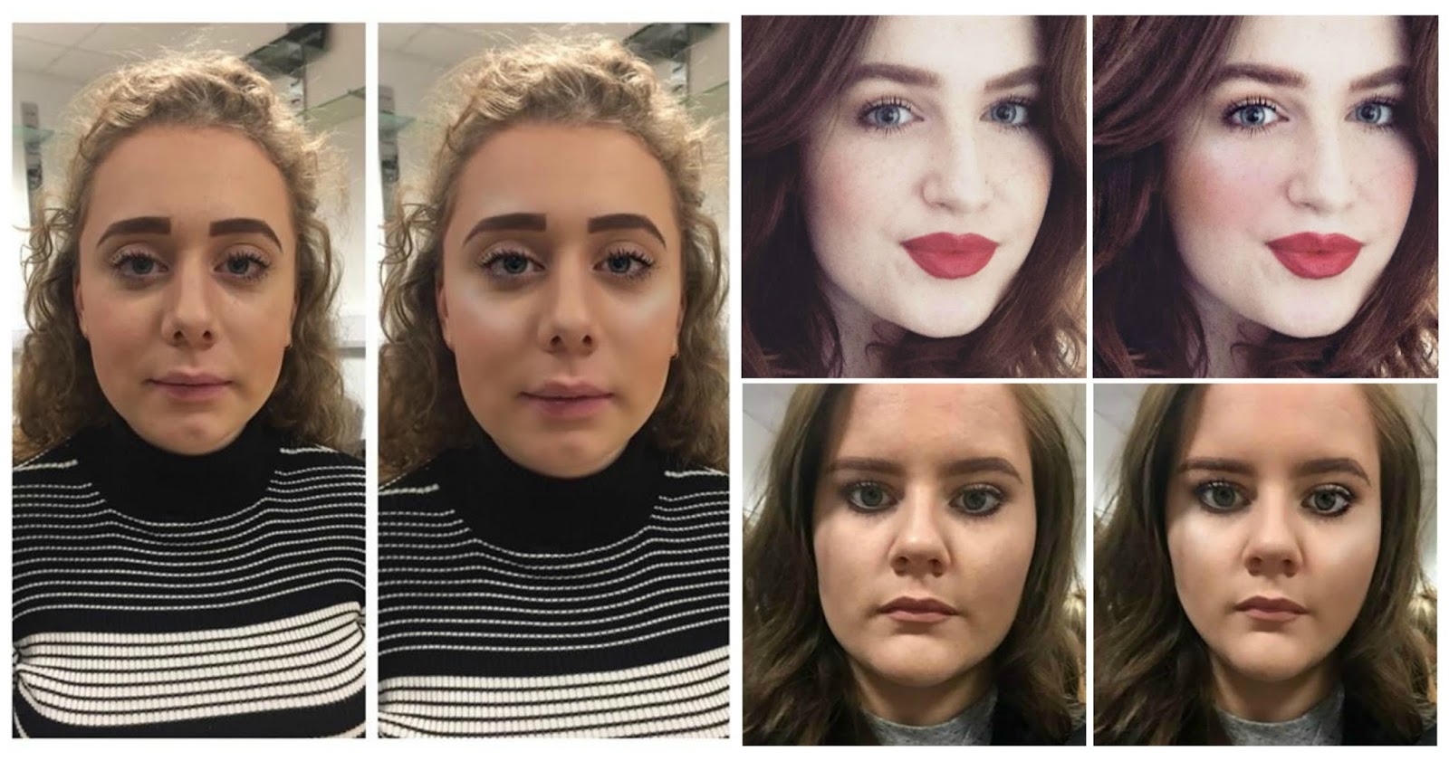
Post production, something that has been used though out photography since the 1860s, however in the early years of retouching it was seen as an art as people would use bleach and different shades of ink to perfect the skin of models and make people look beautiful. Fast forward to today and photoshop and photo editing apps are widely available so people can change the slightest of things to turning them into a completely different person, so for todays lesson we put things to the test and tried out one of the most popular apps called Facetune and here are the results:
1st edit:
- smoothing the skin
- eyes brighter
- defined the eyes
- whiting of the eyes
- reshaped forehead
- highlighted face
- reshaped lips
- made lips more red
- added bronzer
2nd edit:
- defined eyes
- defined lips
- defined hair
- added blush
- added bronzer
- added highlight
- made lips for red
- smoothed skin
- defined eyes
- defined eyebrows
- added highlighter
- reshaped face

Here are some examples on shoots that have been heavily retouched, just by looking at these three examples the most common theme between them all is that they've photoshopped the model to appear smaller than what they originally are. There’s no doubt that we live in a culture that is crawling with images of perfect people – both men and women. Especially women: beautiful, sexualised women surround us everywhere in the modern world with a promise that we could be just as happy, just as sexy, if we could just be them. And there’s a backlash against these perfect images, as feminists and media critics pick apart the messages in the media. Teaching children and teenagers what goes into these images – what they are for which is selling stuff and what goes into them which is lots of work creating the perfect person who doesn’t exist in real life – is a very empowering process, and one that I think should be taught to everyone.
But there’s also a dark side, where women especially are assumed to “always” internalise these images. Feminism teaches us that we will inevitably internalise them, and tells us to feel victimised when we see them. This is a place where feminism stays securely in an old patriarchal place – that women cannot learn to see media images as objects outside ourselves – that we’re too helpless and feeble to see the difference. This teaching demeans our intelligence, and polarises women into a narcissistic tug-of-war where we are either expected to create and enjoy jealousy in others when we’re on the “right side” of this aesthetic, or where we’re supposed to feel that it’s extremely unfair that media images don’t mirror “us” in our real life state. And for teens, adults play into this. From Moms who think their kid is weird for not wanting breast enlargement surgery, to the political activists at change.org,(the press machine behind the teens protesting Seventeen), women and teen girls are still being urged to fight each other over their looks – whether they should do everything possible to attain various standards of beauty, or whether they should have a political view that denies beauty, and demand that public images of women mirror exactly who they are in real life. Media over saturation as it relates to body issues is a distinctly first-world problem, and only part of that problem. Body issues came alongside a general societal wealth that allows us a surplus of food, mirrors, scales in our homes, and ample time to obsess over our “problem areas”. If only Feminist Discourse 101 included these factors in its discussions, there would be a lot more leeway for women and teen girls to have a sane response to the pressures they’re under to be so narcissistic and politically polarised over their own looks.
Tuesday, 13 October 2015
Posing 101


Here are some of my favourite poses/images from fashion editorials. For me personally, I think I like for images to show movement or some form of life coming form the model as it shows that they're human, instead of them being stuck in the same position with the same expression on their face.
- Daphne Groeneveld, one of my favourite models as she really puts herself forward in fashion shoots and she can really fit in well if you need a 'unique' look to your model. This is probably one of my favourite images of her as she radiates beauty, she's rocking a natural glam look yet she looks caught off guard while the photo was being taken which I think is when some of the best images are taken. It's such a simple pose yet such a beautiful beauty shot of her.
- Erwin Blumenfeld's image of Lisa Fonssagrives on the Eiffel Tower is one of my favourite fashion images of all time as the pose itself is so beautiful, it shows beauty and danger and also inspires you to take images in risky places which is what photography should do, make you think about what to do next.
- Although you cannot see all of Gigi Hadid in this image, but she pose just takes my breath away. It may have to do with how beautiful she is, but the way her body is elongated by her legs and arms being on show creates an overall relaxed vibe to the image compared to the over two images mentioned.
- Jean Shrimpton photographed by David Bailey. I think what I love most about this pose is the chemistry you can see in the image between Bailey and Shrimpton which I think is rarely seen in todays photography. It's a very personal pose, as if no one was meant to see this image apart from them two.
- What I like about this image is how Twiggy is moving which was unheard of before the 60s which is a milestone in itself, as it shows photography has came a long way from models just changing their hands and legs, models actually started to run and move across the set it must of been quite fascinating to watch this movement happen.
- And lastly, Lily Cole photographed by Tim Walker. The only simple pose out of all of these images, but that's why I picked it as one of the inspirational poses, as it just shows beauty. She's just sitting in a chair showing off her beauty and she doesn't need to show it any other way apart from just looking into the camera, and to the audience viewing this image.
Nathalie Croquet 'SPOOF' Series

Nathalie Croquet is a French fashion and beauty stylist and journalist, and has been in this industry for 30 years, acting as a photo editor for the likes of Biba and Jean Paul Gaultier. Croquet is widely known for her spoofs of fashion ads, almost making a mockery of the designers original work and questioning what is the beauty and fashion ideal, while also dealing with the issues going on today with the standards of beauty for women. For her series called ‘Spoof’, photographed by Daniel Schweizer, she would replicate a high fashion shoot right down to the lighting, make-up, positions and clothes but instead of using a high fashion model, she would step in their place.
I personally really enjoy these series of images, I think they’re a good way of showing people that you don’t have to look a certain way in order to sell products. One of my favourites of the series is the Givenchy fashion ad as I think it could still pass as a fashion advert but for maybe more mature women. That’s the kind of vibe I get from this whole series, it’s catering fashion adverts and converting them to be suitable for mature/everyday women, which isn’t a bad thing, as it still gets the message across that you don’t have to look like a high fashion model to be beautiful and look like you’re actually meant to be there. Also I guess the other message you get from these images is that if you was wear or posing the way these models are, you’d look very out of place in a normal everyday setting, which also links to the whole idea of the campaign of that you are beautiful without being a model.
Saturday, 10 October 2015
How Do Colours Translate In Black And White Photography?

Casting A Model!
Casting a model is just as important as the photograph itself. As if the model doesn't fit the type of photography you're doing, or doesn't look how you want he or she to look then overall you won't be happy with the final images and especially with todays media and make-up industry, you need to find a model that you can rely on.
Before choosing your model you should always have a casting session beforehand, this is because in todays media images may not always be accurate. If you're unable to meet up with your model, you can ask to Skype or FaceTime them, this way you're seeing them in an unedited light and you can then decide for yourself if they're right for you. Another way of getting to see your chosen model is to ask them to send you an unedited picture of themselves. You should always take into consideration the models features, such as bone structure, eyes, lips and maybe over interesting features on their face like freckles or birthmarks.
Other important things to look for in a model is how experienced they actually are and this'll show when you come to shoot. Look at their portfolio and look at their face and poses to see if they're almost the same in almost every image, or if they're unsure on how to pose then this shows that they're inexperienced whereas for more experienced models this'll come naturally to them. However if your model is less experienced then direct them! Show them how you want them to move their hands, body and face as this'll help them in the long run of their career and help you in getting that shot that you need.
You also need to create mood for your shoot. So, what gives mood to a shoot? There are many things that effect the mood, which includes; lighting, styling, background setting, posing, your chosen model, colour palette, tonal range that's being shown, and high key or low key lighting. All these components will help you create the perfect mood for your shoot and final images.
What To Do Before Shooting: Camera Settings
One of our first digital image lessons was what we had to do before we starting shooting with our model, and this started with the camera settings. When you're taking any image in general it's very important that you get these steps correct as this can effect the overall outcome of the image, making it not as strong or flattering to the model.
Step 1:
set camera to RAW image, this is important as it'll make the image come out pure and crisp and not compress the image making the quality lower.
Step 2:
the camera also has to be set to manual this is because if your camera is set to automatic it can change the lighting of the image
Step 3:
shutter speed needs to be set to 1/160 because if you set it to 1/400 it creates a black shadow at the bottom of the screen, the same if you have it set to 1/600 that same shadow fills the half the screen.
Step 4:
ISO should be set to 100, this is because when you make the ISO higher the more brighter and blown out the image becomes.
Tuesday, 6 October 2015
7 Photographs That Changed Fashion!
After watching 7 photographs that changed fashion, I was so inspired in ways that I could display my model, background, and so much more for my digital images project. So much so that I’m researching the 7 photographers that was mentioned in this short film.


Sir Cecil Beaton (14/01/1904) earned renown as a fashion photographer in the 1920s and '30s before becoming an award-winning costume designer for stage and film productions. In the 1920s, seeking to pursue his interest in photography, Beaton sent photos to editors and fell in with the Bright Young Things, London’s bohemian crowd. He then started working for Vanity Fair and Vogue which is where he became known for unique style of posing sitters with unusual backgrounds.
Cecil Beaton is probably one of the most celebrated and sought-after photographers of the last century. As a young man Beaton was transfixed by glamour but as he matured some of his best photographs would be of old people as they were, capturing their spirit. All stars wanted to be photographed by Beaton and he wanted to photograph the stars. For Monroe, the image which is one of my personal favourites, Beaton had been trying to arrange the shoot for three months but she still turned up an hour and 15 minutes late at a suite in New York's Ambassador hotel.
"She romps, she squeals with delight, she leaps on the sofa. She puts a flower stem in her mouth, puffing on a daisy as though it were a cigarette. It is an artless, impromptu, high-spirited, infectiously gay performance. It will probably end in tears." Said Beaton himself about Marilyn Monroe. Which I think really gives an idea in your head as of what Marilyn was like, and explains why a lot of his photographs of her involve bed, flowers and lots and lots of smiles.Cecil Beaton is probably one of the most celebrated and sought-after photographers of the last century. As a young man Beaton was transfixed by glamour but as he matured some of his best photographs would be of old people as they were, capturing their spirit. All stars wanted to be photographed by Beaton and he wanted to photograph the stars. For Monroe, the image which is one of my personal favourites, Beaton had been trying to arrange the shoot for three months but she still turned up an hour and 15 minutes late at a suite in New York's Ambassador hotel.

Erwin Blumbenfeld (26/01/1897), was a photographer and artist born in Germany. He is best known for his fashion photography published in Vogue and Harper's Bazaar in the 1940s and 50s. Working for both Vogue and Harper's Bazaar, Blumbenfeld created a different spin on fashion photography for Vogue by not questioning facial features like one of the most iconic Vogue covers in fashion history the 1950s Vogue cover which featured a blank background, showing just an eye and lips. A little known fact about this cover, it was actually shot in black and white then added colour at the printing process. Another personal favourite of his which shocked the fashion world for the May 1939 issue of French Vogue that was taken up by the fiftieth anniversary of the Eiffel Tower. It's a big enough risk being up on the Eiffel Tower with safety equipment, but with a model basically hanging on the edge and a photographer trying to capture this moment, probably hanging off various beams as well it's crazy to think that no other photographer will probably attempt this again.

Richard Avedon (15/05/1923) was a American fashion and portrait photographer. In 1946, Avedon had set up his own studio and began providing images for magazines including Vogue and Life. Has soon became the chief photographer for Harper's Bazaar. Avedon did not conform to the standard technique of taking studio fashion photographs, where models stood emotionless and seemingly indifferent to the camera. Instead, Avedon showed models full of emotion, smiling, laughing, and many times, in action in outdoor settings which was revolutionary at the time.

David Bailey (2/01/1938), in 1960 Bailey was a photographer for John Cole's Studio Five, before becoming a fashion photographer for British Vogue. Along with Terence Donovan and Brian Duffy, Bailey captured and helped create the 'Swinging London' of the 1960s: a culture of fashion and celebrity chic.
"The kind lion on the Savannah: incredibly attractive, with a dangerous vibe. He was the electricity, the brightest, most powerful, most talented, most energetic force at the magazine". Said a former girlfriend.
Most interviews I've come across, where a women or man has spoken about Bailey, they seem to talk about their chemistry with him. It has also been said that his shoots are very intermit, and sexual which really translates into most of his work, you can almost see the attraction between him and his model. I think his work really changed fashion photography in which it introduced a sexual vibe without it being completely obvious. Bailey didn't need the model to have their breasts out and be half naked in front of the camera, he knew what worked and what didn't he knew how to make someone sexy without the model even really trying.

Helmut Newton (31/10/1920). In 1946, Newton set up a studio in fashionable Flinders Land in Melbourne and worked on fashion and theatre photography in the post-war years. Newtons growing reputation as a fashion photographer was rewarded when he secured a commission to illustrate fashion in an Australian supplement for Vogue, earning him a contract with the magazine. Newton then left London and went to Paris. Newton still continued to work as a fashion photographer and his work appeared in magazines including French Vogue and Harper's Bazaar. He established a style marked by erotic, stylised scenes, often with fetishistic subtexts. As you can see from the image above, his work brings the question of "what is actually happening here?", with the dark, dim lighting and strange backgrounds to contrast with what the models are doing in his images.

Guy Bourdin (2/12/1928), was a French fashion photographer known for his provocative fashion images. Bourdin worked for Vogue and Harper's Bazaar, and shot ad campaigns for Chanel, Issey Miyake, Gianni Versace, and Bloomingdales. Bourdins first exhibition was held at the V&A in London 2003 which toured the National Gallery of Victoria in Melbourne and the Galerie Nationale Du Jeu De Paume in Paris.
"While convention fashion images make beauty and clothing their central elements, Bourdin's photographs offer a radical alternative." I completely agree with this quote on Bourdins work, just like Newtons work it pushes the boat out and opens a different door on what can be done in fashion photography. It also shows us a different prospective on a beauty image, it shows us the beauty on the human body compared to other beauty images that focus on beauty and clothing.
Bourdins style of photography are often richly sensual but also rely heavily on provocation and ability to shock, integrating erotic, surreal, sinister components. Some criticisms of Bourins work include his models "often appeared dead or injured", critics have accused him of objectifying women, however his photographs were described as "highly controlled" and "famous for a mysterious sense of danger and sex, of the fearsome but desirable, of taboo and the surreal".

Herbert Ritts (13/08/1952). While living in Los Angeles, he became interested in photography when he and his friend Richard Gere, then an aspiring actorm decided to shoot some photographs in front of an old jacked up Buick. He then went to shoot Brokke Shields for the October 1981 issue of Elle, and Oliva Newton-John for her Physical album in 1981. 5 years later, he replicate that cover pose with Madonna for her 1986 True Blue release.
During the 1980s Ritts photographed many fashion and nude photos for models such as Naomi Campbell, Cindy Crawford, Stephanie Seymour and Tatjana Patitz. Other work also included covers for Interview, Harper's Bazaar, Rolling Stone, Vogue, Elle and Vanity Fair.
Subscribe to:
Comments (Atom)